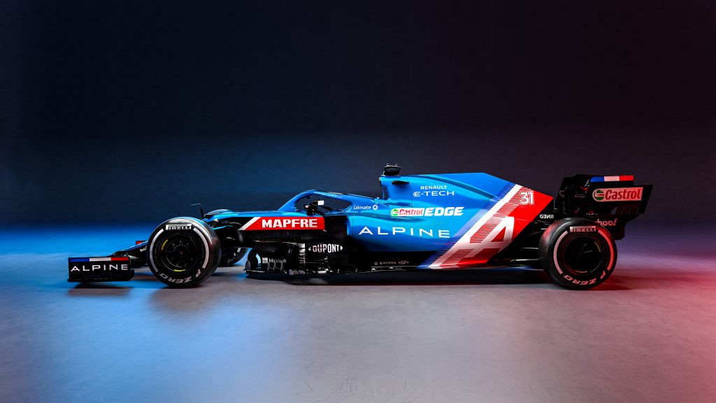
The 2021 Formula 1 season is about to begin, with testing getting underway in Bahrain this weekend. After Ferrari’s car launch today, we have now seen the appearance of every car on the 2021 Formula 1 grid. Say goodbye to the Renault name in F1, as they rename to Alpine to promote their sports car range.
The short lived Racing Point name has also gone as they become Aston Martin, who return to the sport for the first time since 1960. They’ve become what feels like the 15th different named team to be based at Silverstone. I did this exact same article last year so if you’re interested in my ranking, click here.
10. Williams
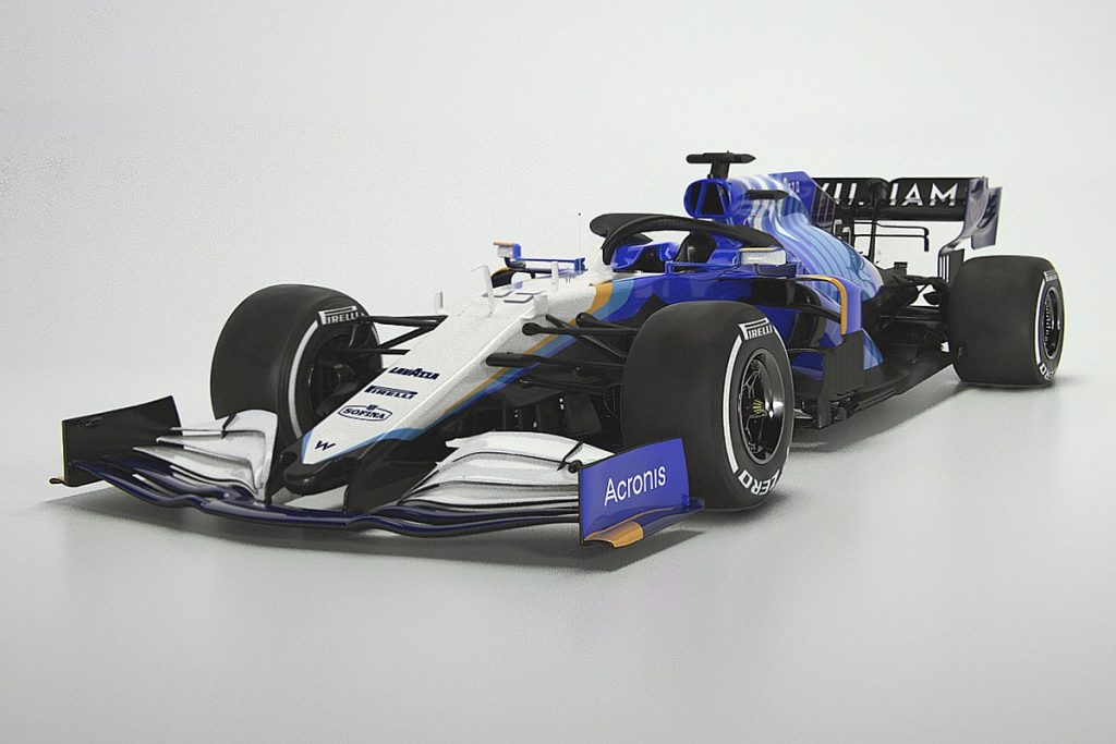
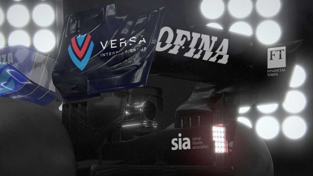
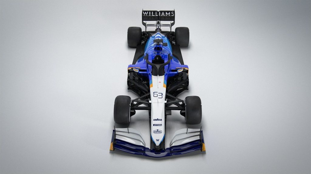
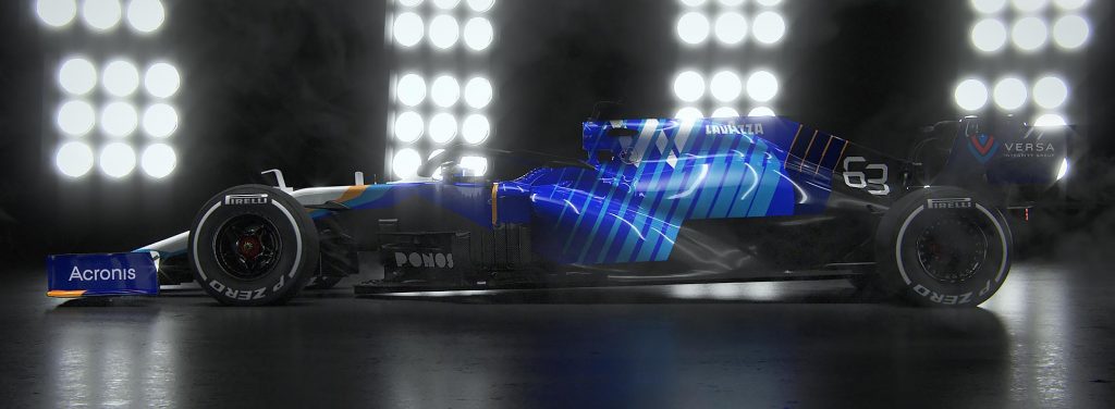
To be fair to Williams, the front of this car is nice, but that’s about it. Yellow makes its return to a Williams car for the first time in a while, whilst F1 fans will be pleased to know that Rich Energy is not on the car. The blue ‘zebra’ stripes into pinstripes pattern is dreadful, i’m not so sure vertical stripes suit a Formula 1 car in the first place let alone this awful pattern. This livery makes you realise just how little sponsors Williams have on board.
I do like the consistency in their branding, as they have kept the ‘Williams’ spell-out logo on the rear wing, that is a sight to behold on a TV broadcast. The alarm clock font for the numbers blends nicely with that. Maybe the livery would look better with a base of the navy colour that’s on the front wing, I just can’t stand the other two shades of blue being used. I’d give it a 4/10.
9. Ferrari
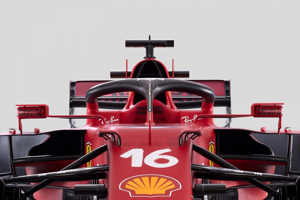
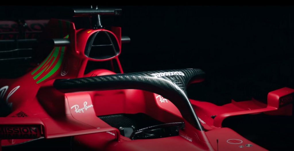
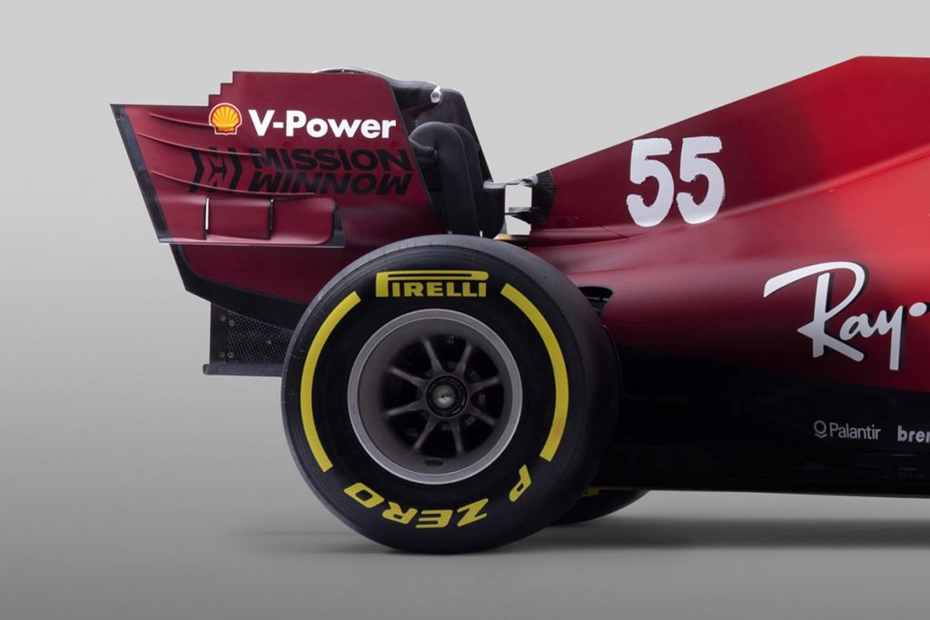
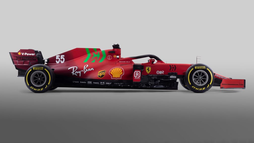
FILMING DAY STATICO – MARANELLO 03/03/2021 credit: © Scuderia Ferrari Press Office
Green and red should never be seen. Facts. This livery has some absolutely gorgeous touches. From the Italian flag behind the prancing horse logo on the tip of the nose, to the almost handwritten number font. But ugh I hate the green…
It just leaves me wanting more. The green does not fit the rest of the car whatsoever. I appreciate the darker red towards the rear wing , I’ve wanted that for a while. It just needs white, swap that green Mission Winnow logo to white and wow you’ve got a beauty of a livery, 5/10.
8. Haas
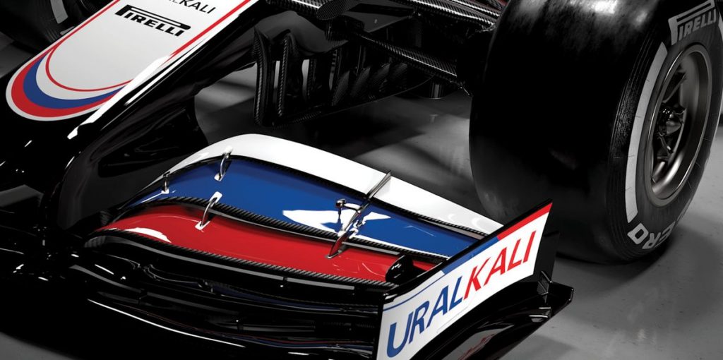
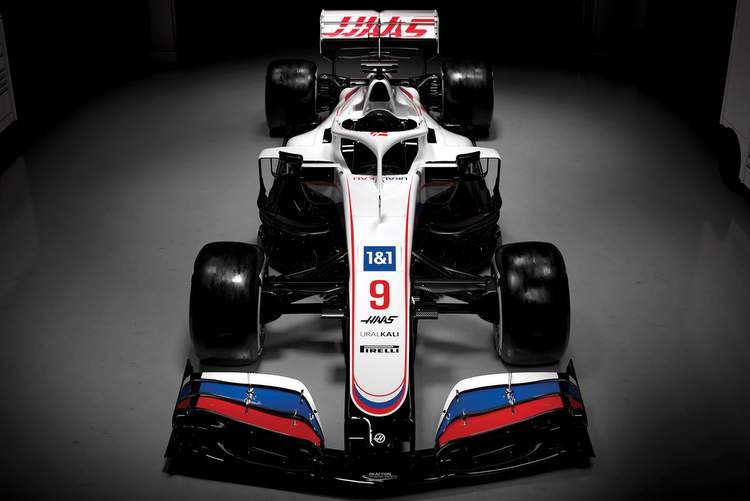
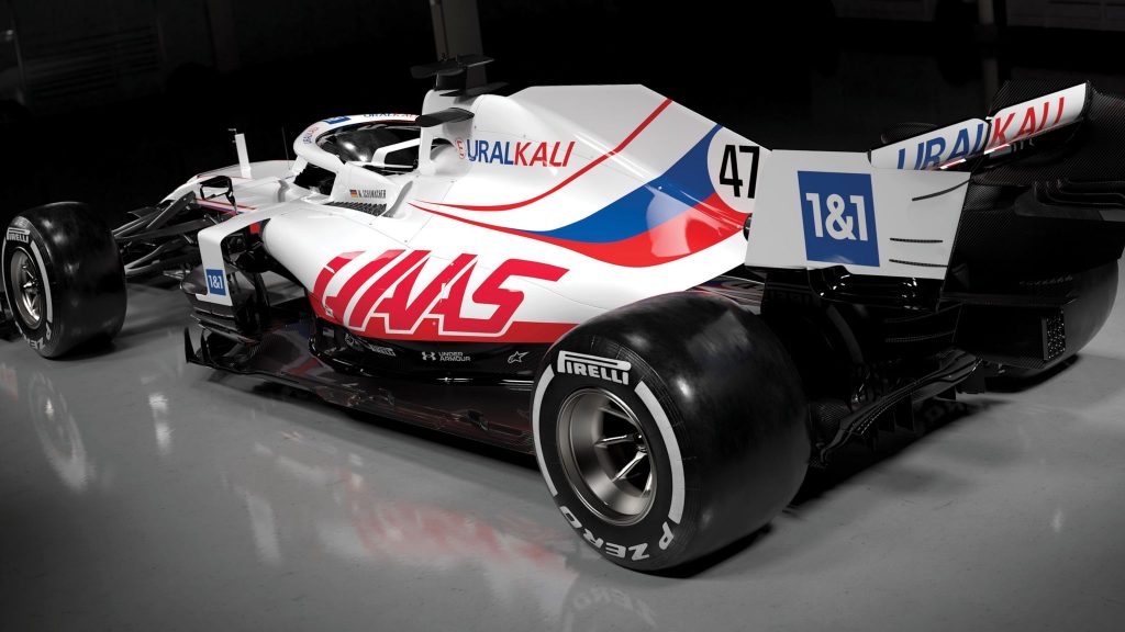
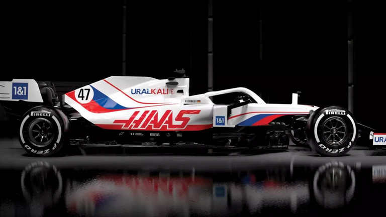
The clowns of Formula 1 are back, from the Rich Energy situation, to drivers battling each other on track. Now it’s so evident that they’re relying on the money of the father of a driver who publicly posted footage of a sexual assault, in this ‘Team Russia’ livery. Haas may have to redesign this car as it could be seen as a workaround of using the Russian flag. Mazepin is not allowed to race under the flag due to The Court of Arbitration for Sport’s ruling late last year.
Let’s assume it stands and take a look at Haas’ current 2021 livery. I don’t rate the rear of the car that much if I’m being completely honest, it’s lacking sponsors, big time. That’s their own fault though. The red outline around the flag is a bit too much, it would look less Russian and more toothpaste manufacturer. I absolutely love the flag on the front wing, it complements the black well. The Haas logo’s dotted about are also nice touches as well as the circle around the back racing number, 6/10.
7. Red Bull
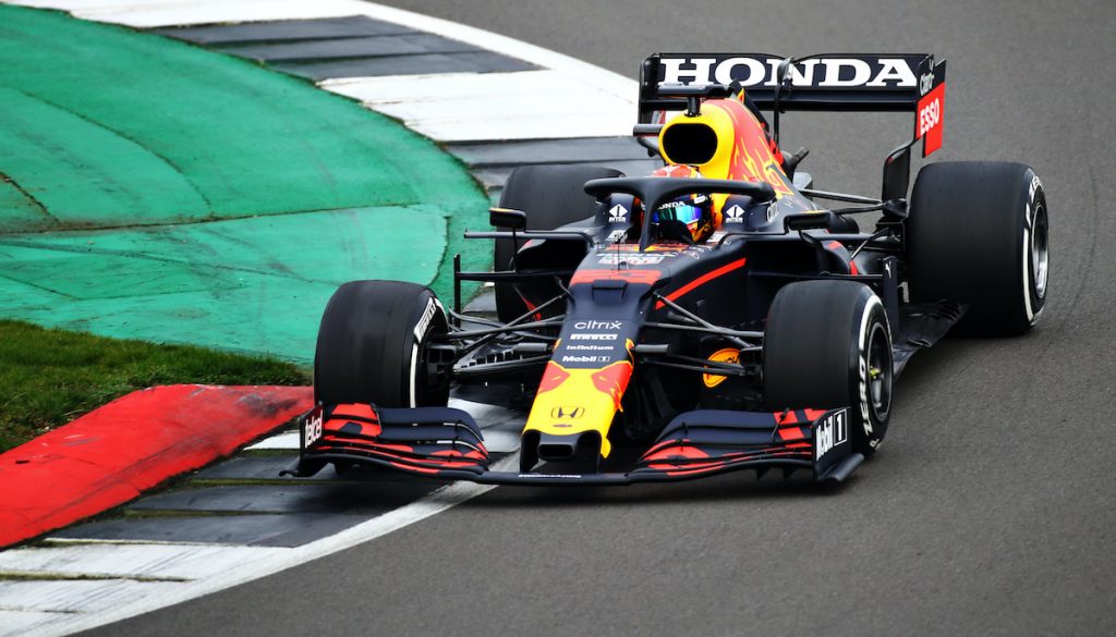
(Photo by Bryn Lennon/Getty Images for Red Bull Racing) 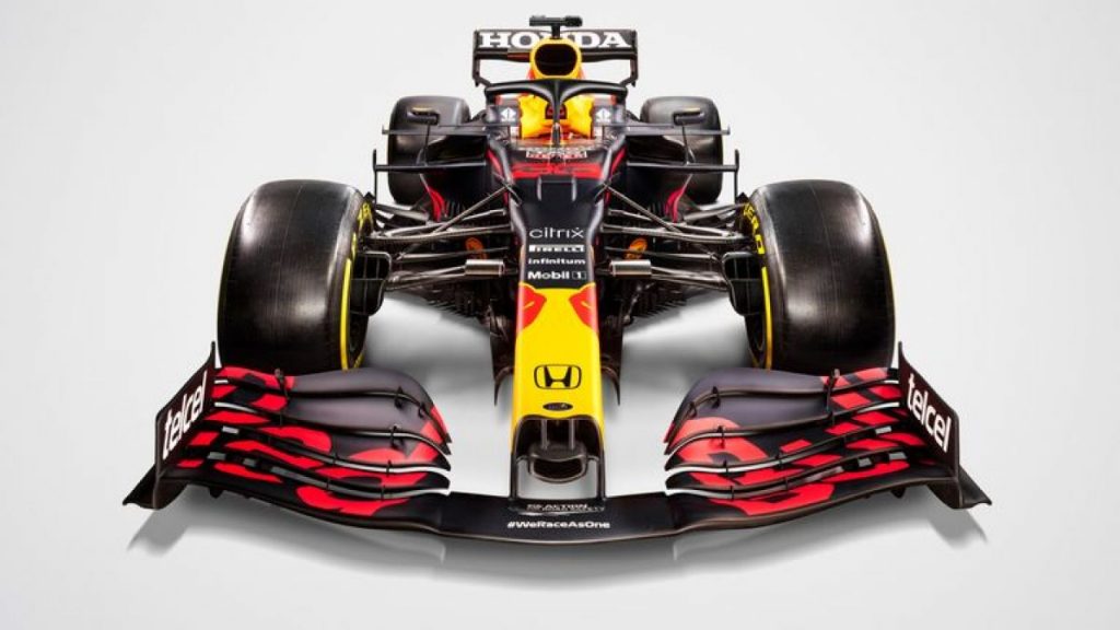
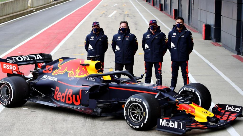
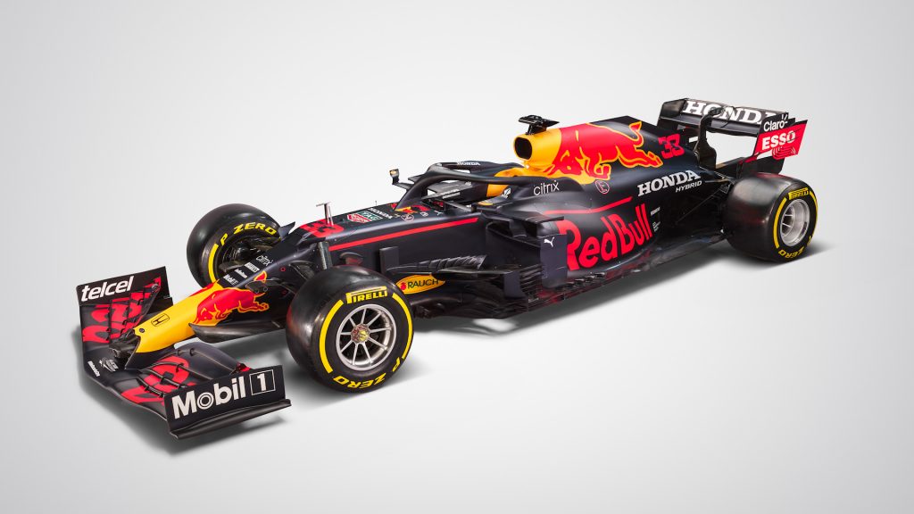
I could genuinely copy and paste everything I said last year, with a few tweaks. Once again it’s the same design just sans the Aston Martin logos. Checo Perez’s sponsors (telcel and Claro) are added, and Honda have an increased presence.
The Honda logo on the rear wing is nice, and will have the same effect as the Williams one. But the really wide font is difficult to see when watching a broadcast. It’s an iconic Formula 1 paint job, but it’s time for a change imo, even if it’s small, 6/10.
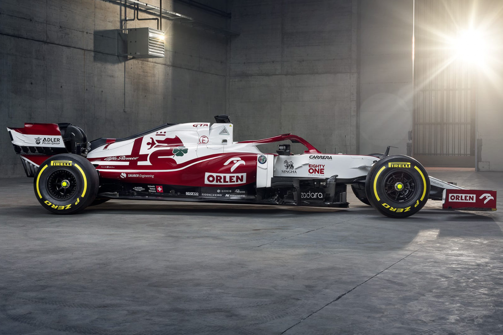
6. Alfa Romeo
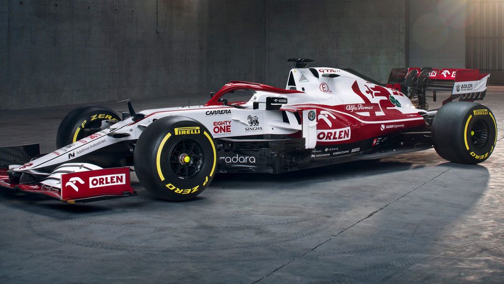
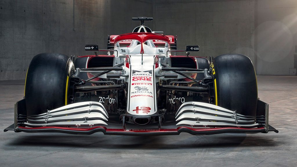
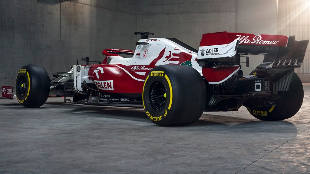
This one may be controversial, but I’m not in love with the Alfa Romeo livery as much as others. I like it, the glossy red is awesome, as are the red sponsors, and the red alfa logo on the white. I just want more red. The little green four leaf clover compliments the white and red well, unlike on the Ferrari, fitting with the Alfa brand.
This could be livery number 1 if the side of the chassis was red, not white. The transition from sidepod to chassis isn’t great. If the red continued and blended with the stripes on the edge of the nose it would be incredible. 7/10, all in all a decent livery.
5. McLaren
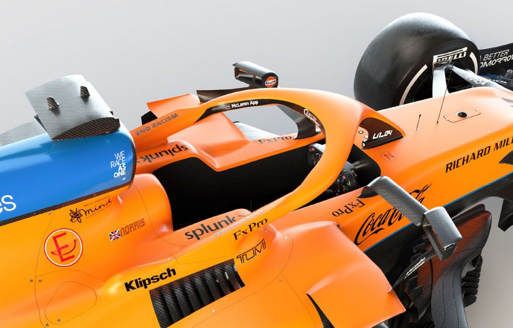
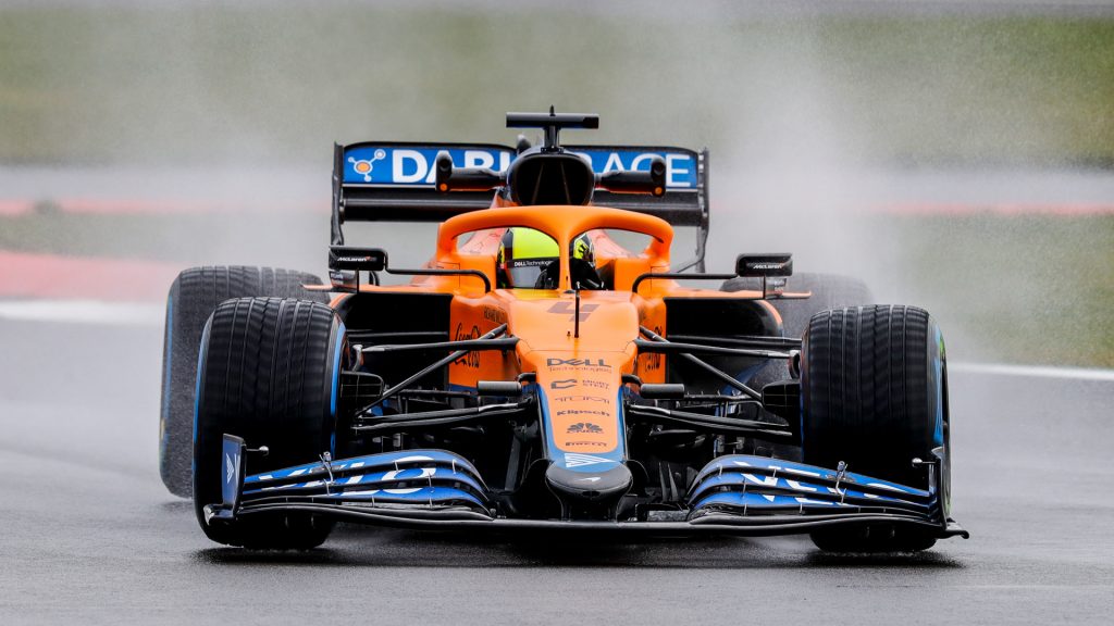
Lando Norris, McLaren MCL35M 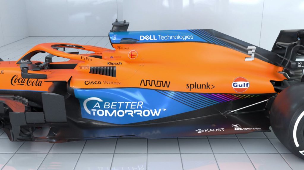
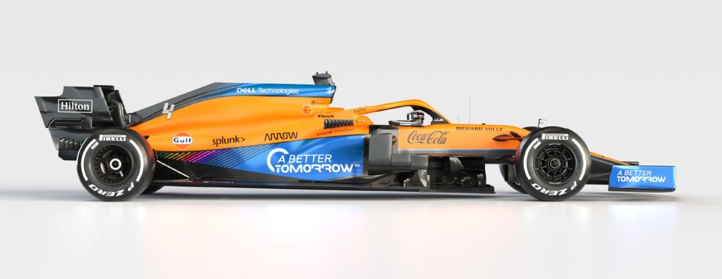
Not much has changed on the MCL35M, but the small details that have changed make this livery a lot neater than last year. For example we have the rainbow lines on the car that now not only have a designated neat place on the car, but also on the teams branding and overalls. McLaren receive extra points for keeping with the WeRaceAsOne initiative.
The thin ‘blind’ lines appear on the number font too, creating a neat package. One other touch I like is the sprinkle of blue on the nose cone and slanted sponsors to match the slanted blue section of the side-pod. Similar but improved, a nice Formula 1 livery, 8/10.
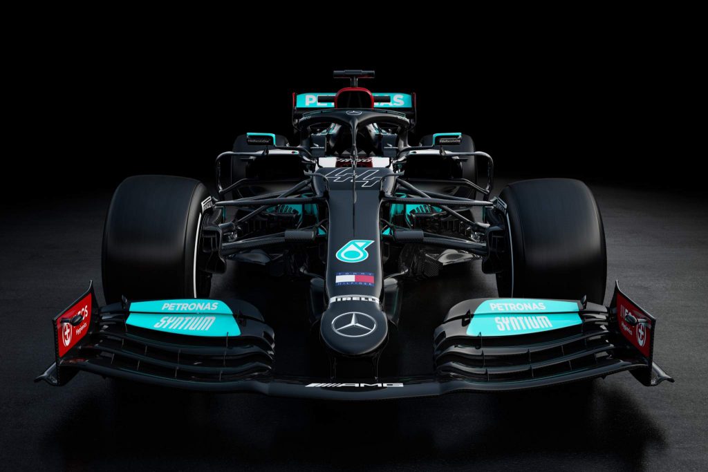
4. Mercedes
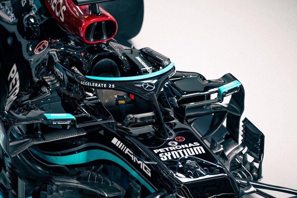
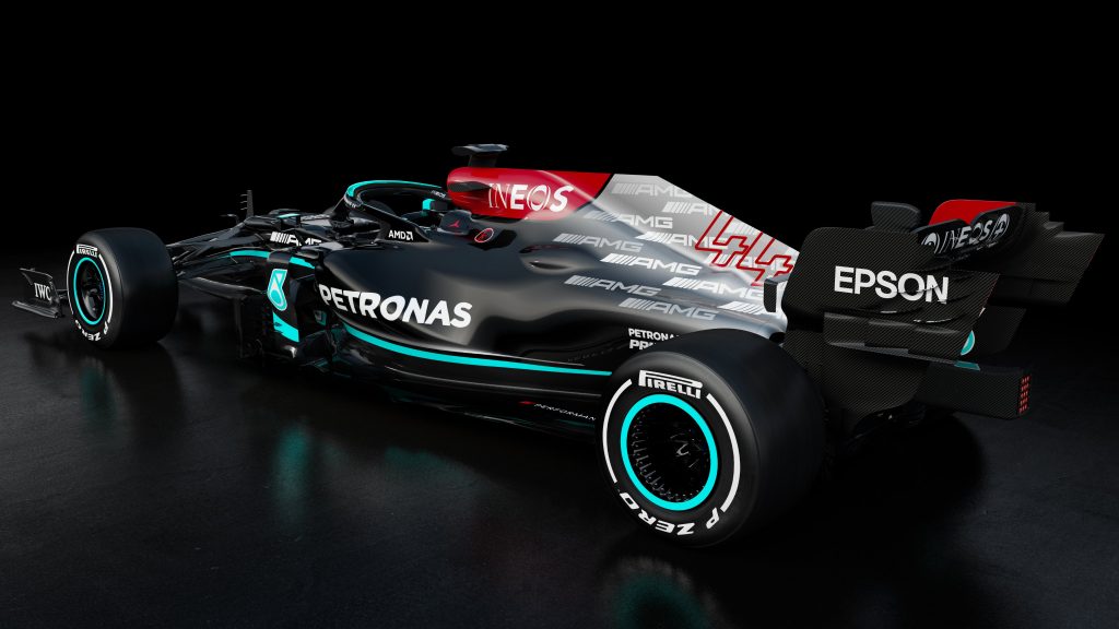
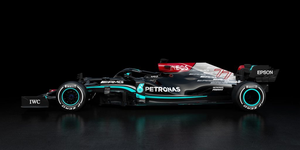
I might get slated for putting it this high, but I absolutely love this Mercedes livery. Not as much as last year, but still quite a bit. Last year’s black livery was special, and I’m glad they’ve kept it. The white stripe above the Petronas teal is a nice detail, it looks better on image than it does on mockup.
The AMG spam is cool, it’s not too in the way like the Williams stripes, but also not invisible. I think it would look ten times better if Mercedes got rid of the gradient it’s covering. Finally, I love the Ineos wine red, as I did last year. Not as good, but still nice, 8/10.
3. Aston Martin
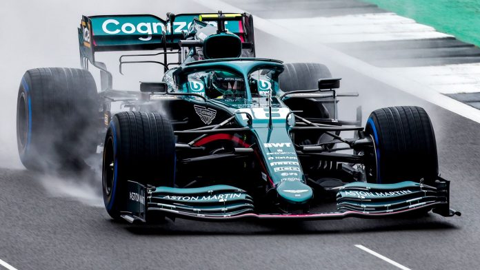
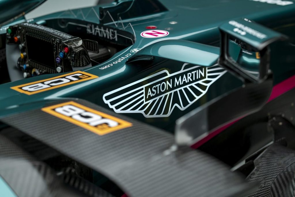
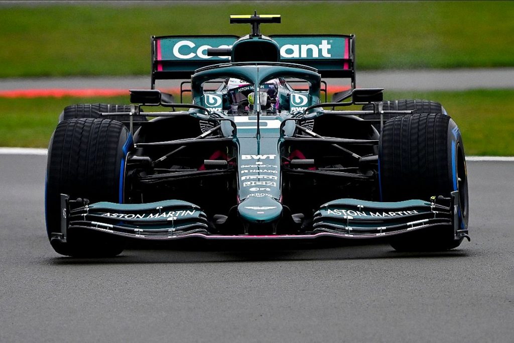
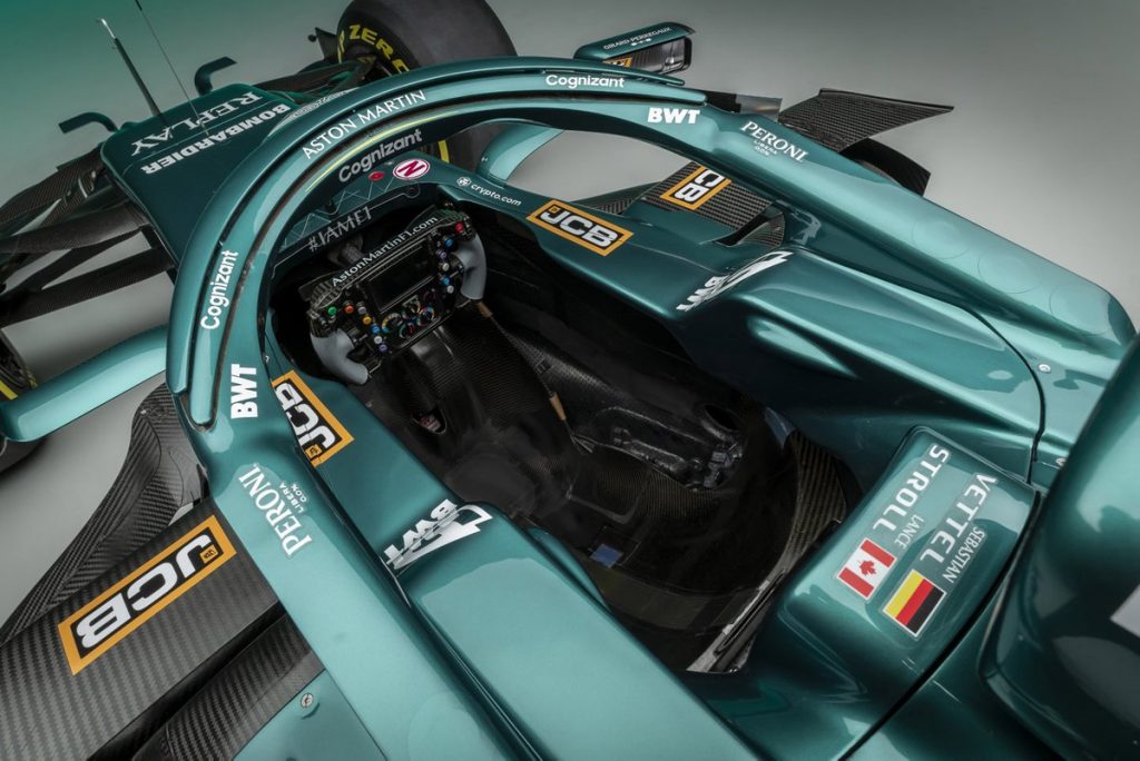
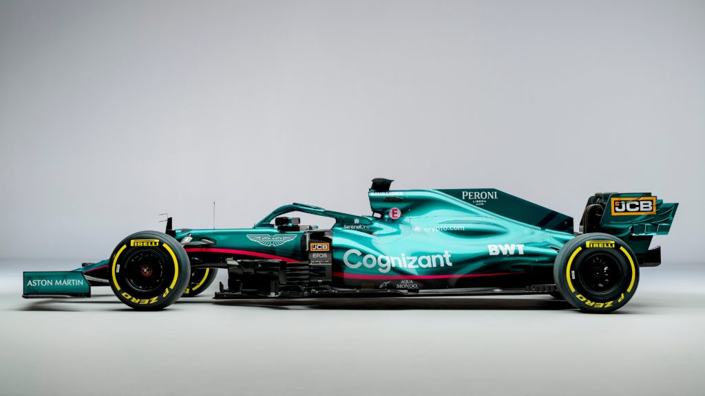
Aston Martin created hands down the most hyped Formula 1 livery reveal in recent memory, but left me a little disappointed If I’m being completely honest. Aston Martin had promoted the event and team with a racing and lime green combination, and even planned to do that before BWT got their wallet out again. I don’t mind the pink, it’s nice. I’d just prefer lime, keep it consistent. All the branding is green and lime, all of it.
I’m just glad the BWT logo is white, because this livery would be ruined with the blue/white combo that was on the Racing Point. My favourite detail has to be the AM wings logo on the side of the chassis. The last thing to note is actually pretty funny, notice how the sweeping stripe of the Mercedes and Aston Martin are very similar. Pretty laughable after the brake duct issue as Racing Point last year. Great, but not perfect, 9/10.
2. Alpha Tauri
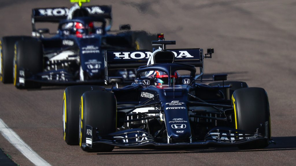
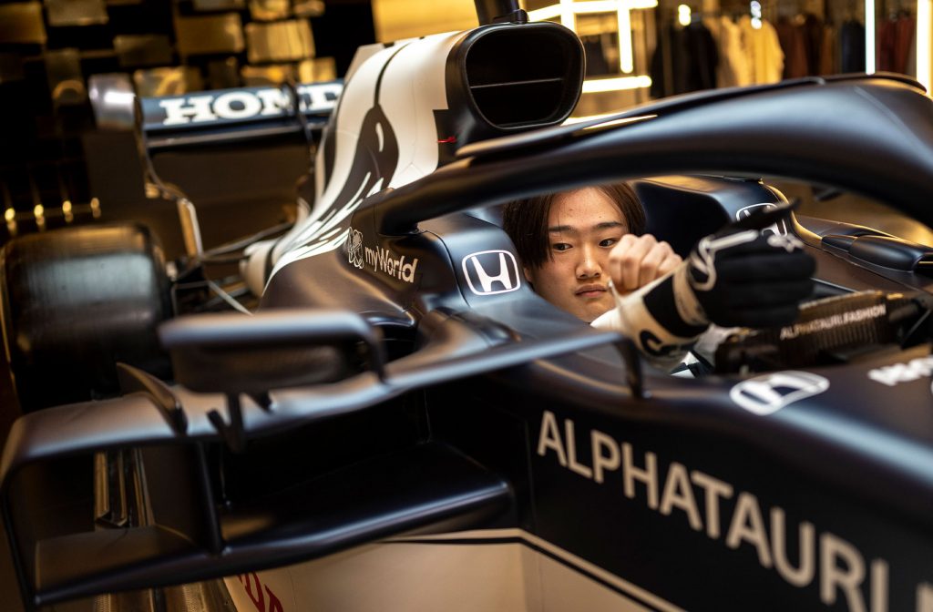
2021 Launch Gallery7 Scuderia AlphaTauri 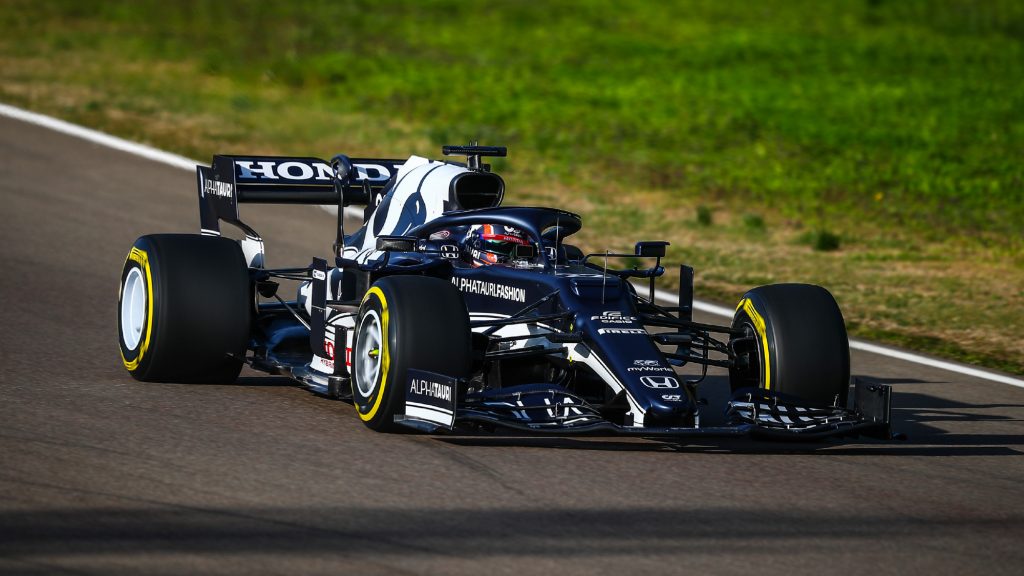
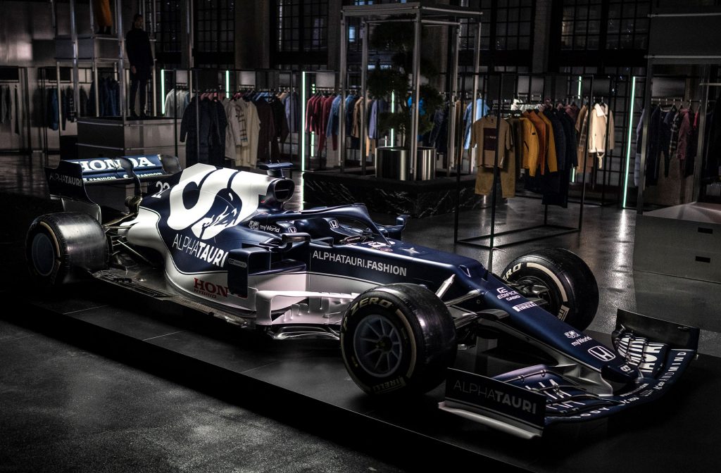
2021 Launch Gallery16 Scuderia AlphaTauri
Corrr this year’s Alpha Tauri is a stunner, and it actually looks good in the light! Unlike last years attempt which flattered on track. The sun really brings out the matte finish and the simplicity in the sweeping white lower is effective.
Just like in the Red Bull, the Honda written logo on the rear wing will look cracking on television. Almost everything wrong with last year’s design has been fixed. The number just needs to be visible on track, which I don’t think it is on top of the chassis (top left photo.) Almost perfect, 9/10.
1. Alpine
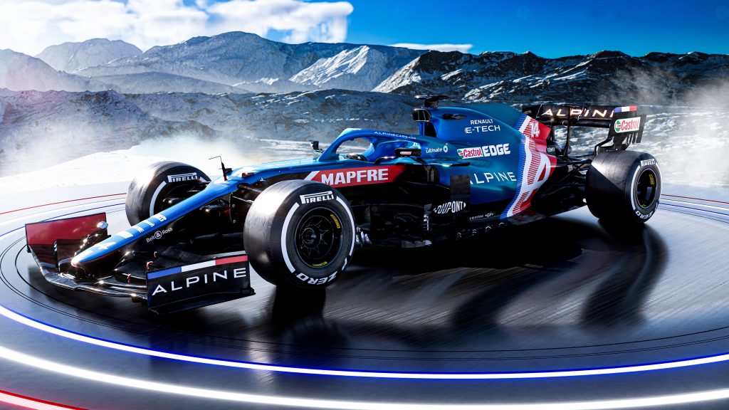
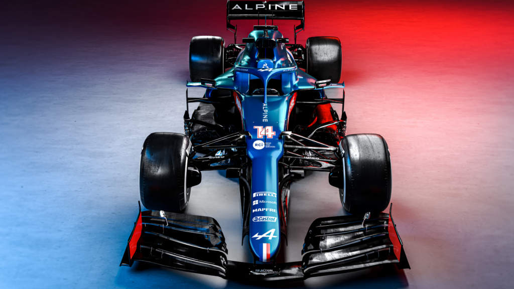
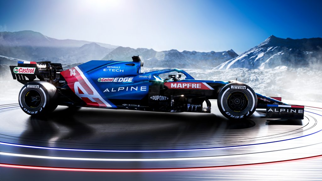
I have to be honest guys and girls, I was pretty disappointed with the fact that\ the Renault yellow was leaving the Formula 1 grid. That livery was my number 1 last year. I loved how the black complemented the yellow, as well as the French flag on the tip of the nose and the blue on the airhorn throwing back to the early Fernando Alonso days.
Now Fernando is back in F1, and back at the same team he won 2 World Championships at in the mid 00’s. Alpine have embraced their mixed British-French heritage by including elements of the Tricolore and Union Jack. The best part of last year’s Renault livery (French flag on the tip of the nose) is back. The black on the side of the chassis also returns to complete a 10/10 livery.
So there you have it, there are my livery rankings. What do you think? Get in touch.
For more on Bahrain testing and all things Formula 1, visit our dedicated page here. Meanwhile, follow us on Facebook for more opinions and analysis right to your timeline.

