F1 has been back for three weeks now, and what a start of the season it’s been. We’ve had an absolute classic in the first race of the year, and a wet qualifying to remember last weekend, with some stunning cars on show. This weekend the Hungarian GP will take place.
We, of course, aren’t talking about the races today, nor the Racing Point protest, nor the Ferrari chaos I’m just simply going to go through which F1 livery I believe to be the best of the 2020 bunch. So without further ado, let the criticism commence.
10. Racing Point
(Photo by Javier Martinez de la Puente / SOPA Images/Sipa USA)
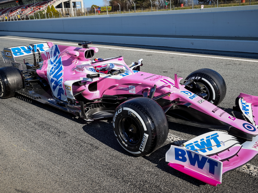
First impressions, the pink and white combo is not a good look in my opinion, especially in daylight. I do however like the font for the driver numbers the darker pink goes with the car, as proven with the maple leaf on the halo, it is a nice accent. The diagonal white section on the sidepod looks odd, if anything the car needs some more dark colour.
Another positive is the colour on the JCB, Pirelli, and Claro logos, it ever so slightly takes away the horrible pink panther style colourway. At the end of the day, it WOULD be alright, not the best but not terrible, IF the plastering of the BWT logo didn’t make it the worst livery I’ve seen in recent years. Roll on Aston Martin 2021.
9. Williams
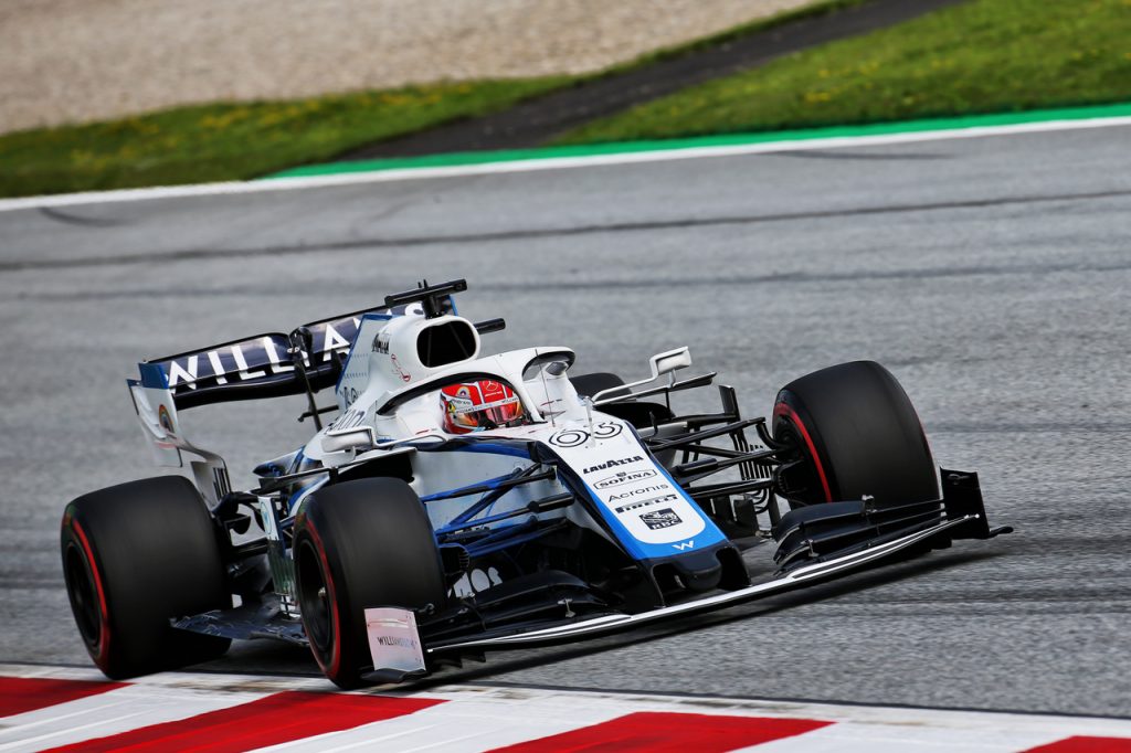
Not really my thing, it’s got a bit too much of a PowerPoint design ideas feel to it on the sidepod which is awful. To be fair to Williams I like the rear wing, and it does have a really clean driver number font that fits in with the white well. As does the WeRaceAsOne rainbow on the halo, a nice touch. I do however much prefer the ‘Colgate’ livery.
The stripes leading from the nose to the rear wing give me Brawn GP 09′ vibes, but I’m not so sure the blue works as well as the volt green did. The F170 logo on the chassis, just below the halo adds a spot of red, which makes it look less bland. The black block on the bottom of the halo is something a bit different but does look pretty good. All in all though, the rear of the car isn’t the greatest and brings the Williams livery down in the rankings for me.
8. Red Bull
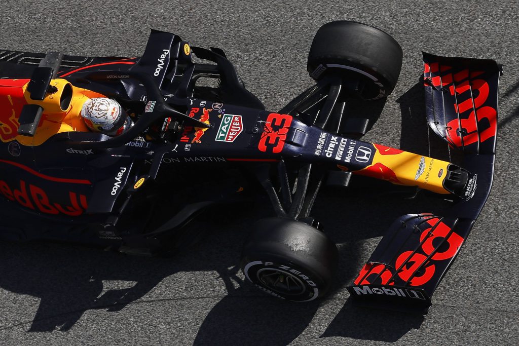
The Red Bull livery is marked down because it’s the same as last year. That doesn’t mean it’s bad whatsoever, it’s not. The Red Bull livery is and always will be one of the most iconic paint jobs out there. It is however literally a carbon copy of the past two liveries, it’s getting a bit boring. There is a slightly more matte finish, which has always been a strong point on the Red Bull car.
I absolutely love the navy blue alongside the world-renowned yellow and red branding, which does make a standout livery. I do also really like the pinstripe leading to and from the Aston Martin logo. The sponsor colour and placement on the car always looks clean. The same can’t be said for the number font.
7. Ferrari
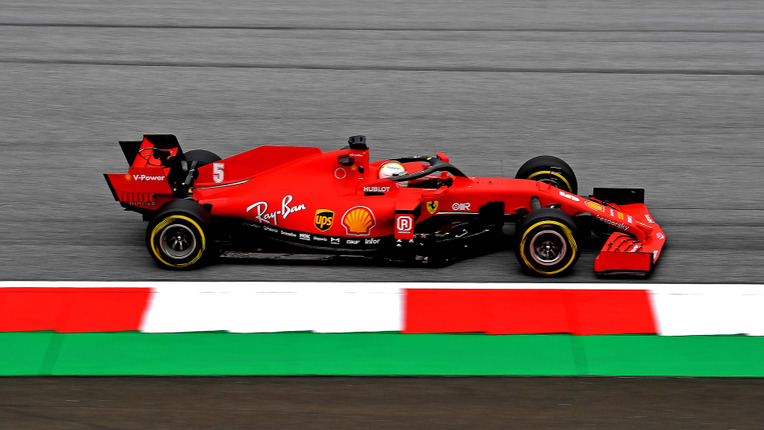
Ah, next up the Scuderia! Coming in 7th place, which in actual F1 I think they’d be pretty happy with at the moment. I believe that this is the worst looking Ferrari in a while. This livery isn’t bad but has nothing on the 2018 equivalent. First off It’s not a nice shade of red, the other recent Ferrari’s had a much nicer look on the eye.
Initially, I thought that there was too much black on the car, but the Mission Winnow sponsorship has disappeared and that’s no longer much of an issue. The UPS logo doesn’t coordinate with the other sponsors so is a bit annoying to look at, sadly. My big negative with this car is it lacks the Italy factor of a classic Ferrari. Normally there’s some big Italy gesture on the car, that looks fine indeed. It is still a Ferrari, and I do still like the livery. It could just be sooo much better.
6. McLaren
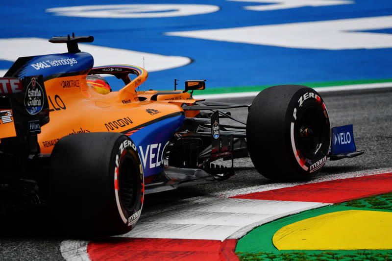
McLaren had one of my favourite liveries last year, but this season’s equivalent isn’t as nice. I didn’t like the plain orange halo when this design first came out, and since then the WeRaceAsOne rainbow was added to it. I really like it now, as it looks less plain and elevates it in my rankings.
However, the Number font is awful, and not very visible in black. To be fair, the rear wing is clean, and I like the blue to rainbow to black gradient leading to it on the sidepods and running down from the t cam and airhorn. All in all, not a bad effort from the papaya and blue.
5. Alpha Tauri
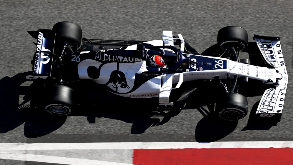
Here we’re getting onto the liveries that I really love. I do get the hype behind this livery, there are some really good looking features. I think the Red Honda logo on the side of the car is beautiful and should be elevated more. It’s the best feature on the car, as it stands out to the rest of the colour scheme.
IMO it has the best looking back of the vehicle on the entire grid. The Matte white/navy looks fresh, they’ve got the Alpha Tauri branding and slogans on the car absolutely spot on too. The Red Bull logo looks fire in navy. But I like others more.
4. Haas
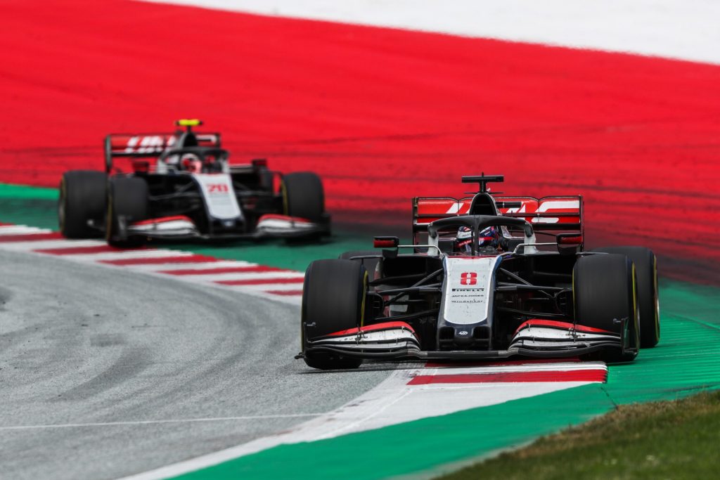
Next up Haas, I actually really liked their gold and black Rich Energy livery last season, and this is very different but just as good in my opinion. It’s a bit basic, but it’s one of the most smart and clean designs on the grid, It’s simplistic and neat.
The Red Chevron is a nice touch, as is the giant Red Haas logo on the sidepod. It’s a similar colour scheme to the 2018 car, but this livery is executed much better. The red on the front and rear wing looks great, as does the driver number.
3. Alfa Romeo
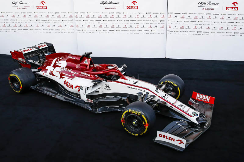
Alfa Romeo is one of the most world-renowned car brands, but so far since their transition from Sauber, their liveries haven’t been all that great. This, on the other hand, is an absolute stunner. First off, the big Alfa logo is so beautiful in all white, mixing with the metallic red.
This livery also features my favourite halo on the 2020 grid, as it blends perfectly with the rear of the car. The bright red Orlen logo on the white makes the car for me, so thanks, Robert Kubica. I also like the black-red-black-red sponsor arrangement on the nose. There’s some more red on this livery, over the previous Alfa Romeo liveries, which is perfect.
2. Mercedes
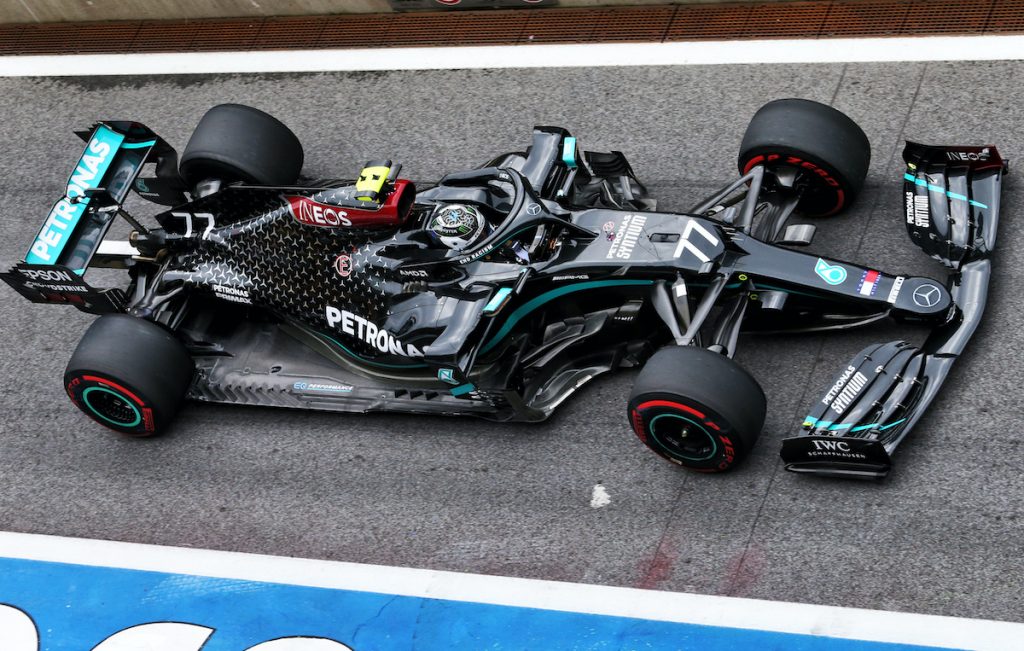
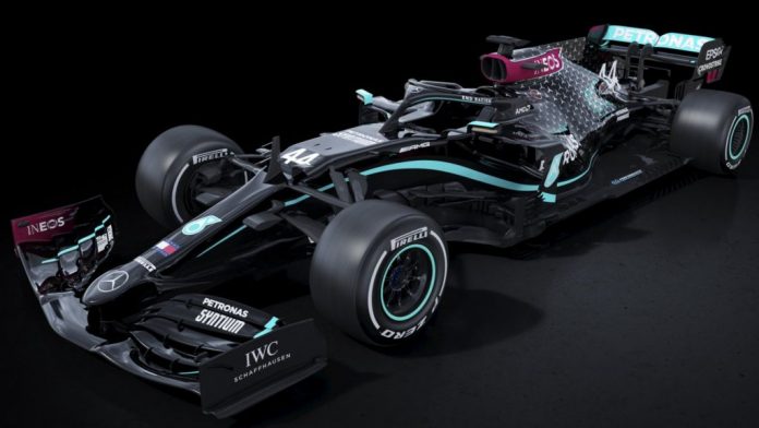
Last month we saw Mercedes switch from their traditional ‘Silver Arrows’ look to this slick black livery, in support of their six-time world champion driver Lewis Hamilton, and the Black Lives Matter movement. The message is an important one, and it’s a great way to support their superstar. I much prefer it to the Silver livery, which would have been just below the Red Bull in 8th place.
The black suits the block swoosh, which the silver didn’t, whilst the Petronas logo stands out a lot more. The back of the car is a bit messy IMO, so not my number 1 livery, but it’s up there. The Ineos red looks better when mixed with black, I’d like more of it.
1. Renault
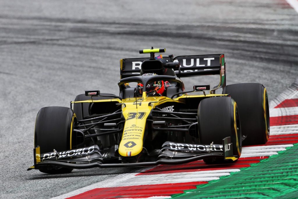
And here it is, it was my number 1 last year and now probably just under 18 months later, cheers coronavirus, the black and yellow Renault tops the charts again. It’s pretty much the same livery as last year, with only a few tweaks for the better. That’s because the yellow segment of the car wraps around the rounded nose.
That yellow stripe down to the front wing looks much better with this year’s car, it has substance. You can’t see it in the photo, but the blue stripe on the airhorn is my favourite part of this Renault livery, throwing it back to the glory days with Fernando Alonso. The rainbow on the tip of the nose shows off the WeRaceAsOne rainbow, which is a nice touch.
So there you have it, there are my livery rankings. What do you think? Get in touch.
For more on the Hungarian GP and all things F1, visit our dedicated F1 page here. Meanwhile, follow us on Facebook for more opinions and analysis right to your timeline.

